
Nu-Calgon, a HVACR chemical distributor, had very outdated packaging. I had the opportunity to redesign and totally overhaul the look. With over 150 products, this was a major undertaking. Below you can see a comparison of the old, outdated label and the new, updated look on a bottle of Nu-Brite, their flagship product.
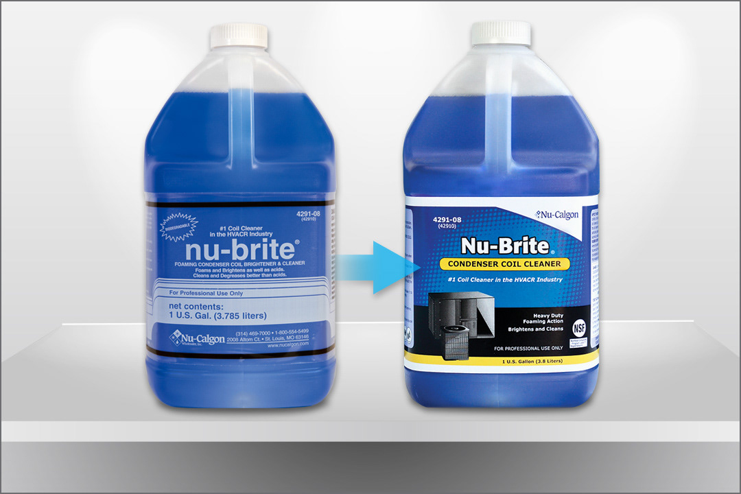
I added color, texture, and images to the packaging to make the use of the product easier to identify, as well as, more visually appealing.
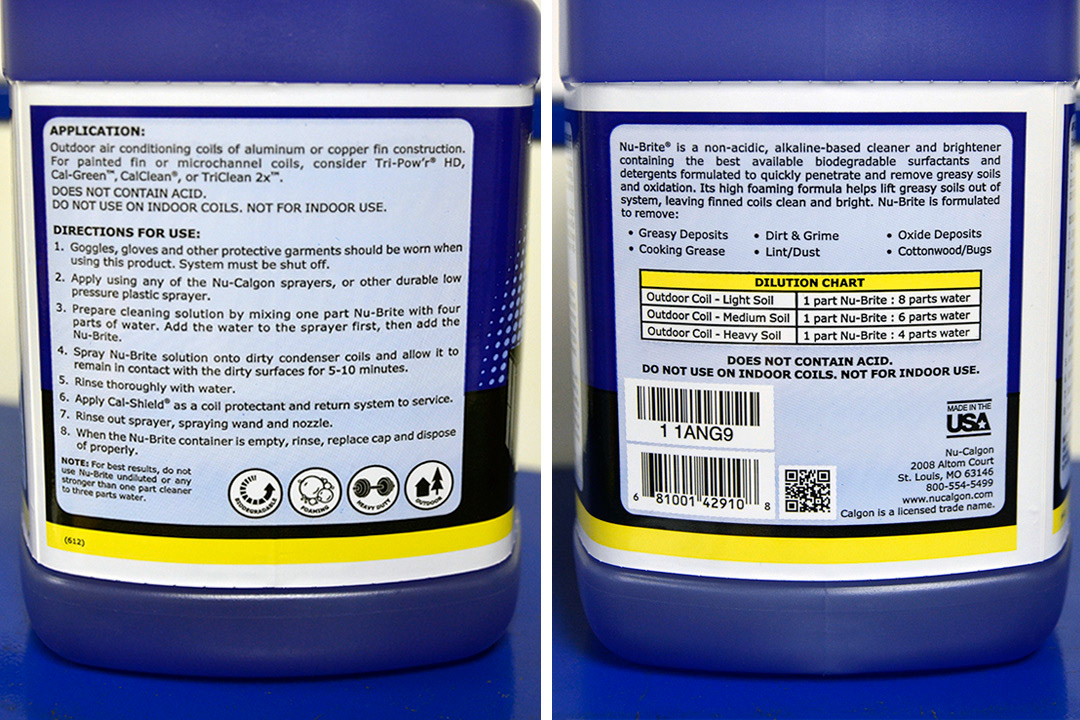
By adding a bright yellow bar identifying the type of product and the pictures right on the front, the consumer can now quickly identify what the product is and what is it used for. I also added icons and charts to the side panels to give the end user some quick cues.
One of the objectives was to give each of the product categories a cohesive look that also coordinated with the product line as a whole.
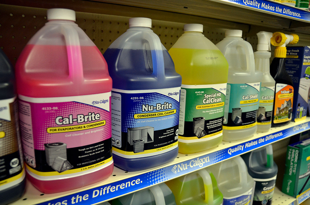
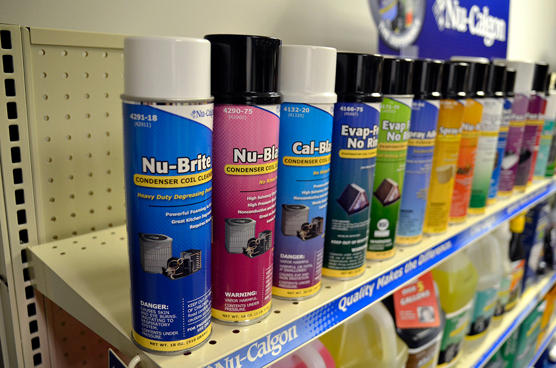
Below is the picture of a large number of the products on a wholesaler's shelf. Also pictured are shelf strips and header signs with the same look that were designed to brand the shelving.
